2026’s Mobile Optimization Guide for Local SEO Success
Restoration SEO
15 May
Since most of your prospects are using mobile to search for your services, we don’t need to explain to you the importance of mobile optimization for local SEO.
The question is, how do you do it? What’s the best approach in 2026?
These days, mobile optimization is much more than just passing Google’s mobile-friendly test. You’ve to compete hard to turn urgent mobile searchers into booked jobs before your competitors. So your strategy should be built to win.
This is what this guide is about. We’ll share what works now for small, locally-operated businesses. It’s based on our decade-long experience of auditing and rebuilding the mobile experience for hundreds of service businesses.
Follow it religiously and hopefully, you’ll see continuous progress over time.
The Importance of Mobile Optimization for Local SEO
Did you know Google rolled out mobile-first indexing as the universal default back in 2023?
Since then, Google’s mobile bot’s been crawling and ranking websites based on what the mobile version shows. So, the desktop layout has lost its significance.
If your mobile site isn’t optimized; i.e., it loads slower, hides content behind toggles, or strips out structured data, your SEO won’t deliver anything meaningful.
The numbers behind mobile local search are also stark.
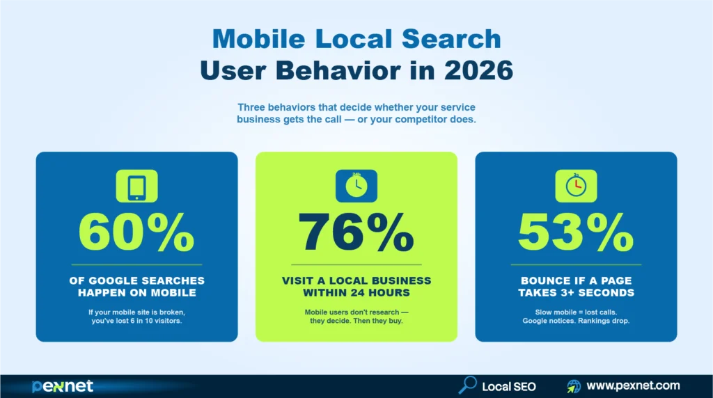
Over 60% of all Google searches happen on mobile devices. According to Think with Google, 76% of people who search for a local business on their phone visit one within 24 hours.
For local businesses, especially emergency-driven niches like restoration, crime scene cleanup, or tow truck, the share is even higher. That’s because people mainly use mobile for these services.
Also, when you do mobile optimization, you improve these three ranking signals:
- Your Core Web Vitals scores,
- Your mobile bounce rate, and
- Your click-through rate from mobile search results.
All three feed back into how Google positions you in the local pack and AI Overviews.
Beware of the Common Mobile Optimization Mistakes
Before we get into the strategy, here’s what experience has taught us.
Passing Google’s Mobile-Friendly Test with flying colors doesn’t guarantee higher rankings.
Why? Because PageSpeed Insights scores can be gamed.
A site can hit 90+ score while the real-world Core Web Vitals from Chrome User Experience Report can tell a different story.
The lab score is a controlled test while Google uses the CrUX field data for ranking. So, you should always check both.
If you’ve some SEO knowledge, you probably know responsive design is the recommended default. But for emergency service businesses, a stripped-down mobile-first design usually outperforms a responsive layout that has dragged desktop content onto a small screen.
To attest to that, Google’s popular search analyst John Mueller confirmed Google doesn’t penalize different content depths between mobile and desktop, as long as the mobile version covers the topic adequately.
Finally, some unprofessional SEO agencies use different plugins and scripts to temporarily increase mobile speed. As expected, the speed goes back where it was after a few months, and your investment goes to waste.
Here’s a list of the common mistakes:
- Intrusive interstitials: pop-ups that cover the page on mobile trigger a direct Google penalty under the Page Experience guidelines, such as cookie banners, email signups, and chat widgets that block content.
- Tiny tap targets: buttons under 48px wide force mis-taps and accessibility complaints.
- Hidden phone numbers: burying contact info inside a hamburger menu costs you calls from urgent searches.
- Slow third-party scripts: chat widgets, marketing pixels, and review platforms each add 200–500ms to load time. Audit them quarterly if possible and remove anything that doesn’t help with revenue.
- Stripped-down mobile content: if your mobile page has less content than your desktop page, Google indexes the lighter version and your rankings drop.
- Auto-playing video or audio: drives bounce rate up immediately on mobile and signals poor UX to Google.
- Forms longer than five fields: mobile form abandonment climbs sharply after the fifth field. Cut every optional field.
5 Mobile Signals Google Watches Closely in 2026
Here’s what you should know about mobile signals essential for your local SEO campaign.
1. Mobile Page Speed & Core Web Vitals
Page speed is the most important mobile factor for Google. These three Core Web Vitals are vital in 2026:
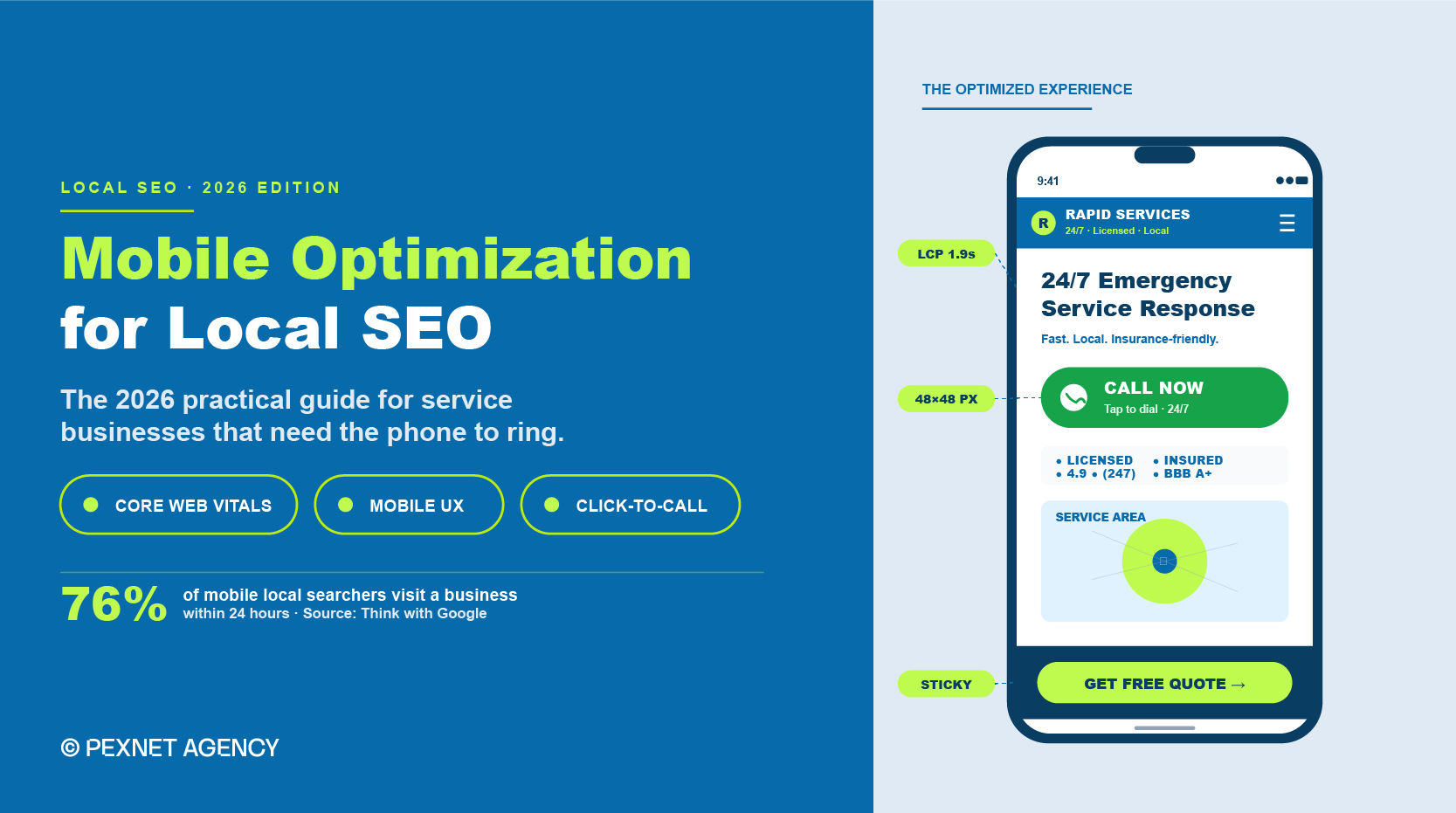
a) Largest Contentful Paint (LCP): how fast your main content loads (Target under 2.5 seconds on mobile).
b) Interaction to Next Paint (INP): how quickly your site responds to taps (Target under 200 milliseconds).
For your information, INP officially replaced the First Input Delay in March 2024 as the responsiveness metric.
c) Cumulative Layout Shift (CLS): how much your layout jumps while loading (Target under 0.1).
In fact, Core Web Vitals sit inside Google’s broader Page Experience signals, which also include HTTPS, mobile usability, and the absence of intrusive interstitials. Google looks into all of them when evaluating your page quality.
We recommend that you run your homepage and top three service pages through Google PageSpeed Insights at least monthly.
What’s more, since mobile scores usually run 20-30 points lower than desktop, don’t compare them directly. Here’s our recommended fixes:
- Image compression to WebP,
- Lazy loading below-the-fold content,
- Removing unused JavaScript, and
- Deferring third-party scripts like chat widgets and tracking pixels.
2. Responsive Design

Responsive design is much more than just shrinking your desktop site to fit a phone screen. You’ve to rebuild the user experience around how we hold and use a phone.
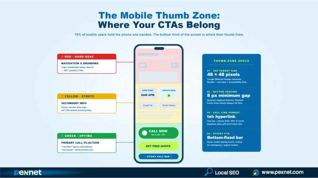
The thumb zone matters here – the bottom third of a phone screen is where our thumbs naturally land.
So, put your most important actions like call buttons, form submissions, and booking links there. Since the top of the screen is harder to reach with one hand, reserve it for branding and navigation.
Test your site on at least three real devices – a) an older Android phone, b) an updated iPhone, and c) a tablet.
Note: Don’t use emulators because they miss serious issues like font rendering, touch lag, and how scrolling behaves on slower processors.
3. Click-to-Call and Tap-Friendly Elements
Every phone number on a service business website should be a tel: link that triggers a call with one tap.
This may sound basic, but roughly 40% of small business sites we audit either skip the link or hide it behind a contact form.
Remember, touch targets need a minimum size of 48 × 48 pixels with at least 8 pixels of spacing between the adjacent buttons. This standard comes directly from Google’s Material Design accessibility guidelines and Google’s mobile usability documentation.
Anything smaller forces users to zoom, mis-tap, or give up. Sme common offenders are: footer links stacked too tightly, social icons sized for desktop, and mobile menu items spaced like dropdown menus.
4. Mobile-First Local Schema & Structured Data
Google’s mobile bot will read your structured data exactly the same way as the desktop bot only if your mobile site actually contains the schema.
Some sites strip JSON-LD on mobile to save the load time, but it kills local pack eligibility and reduces visibility in AI search tools like Google AI Overviews, ChatGPT search, and Perplexity.
Make sure your mobile pages include LocalBusiness schema (or a specific subtype like ProfessionalService for restoration companies, LegalService for law firms, or Dentist for dental practices), proper NAP markup, opening hours, areaServed, and review markup where applicable.
You can then validate it using Google’s Rich Results Test with the Googlebot Smartphone user agent selected.
Schema also reinforces your entity relationships. When your LocalBusiness schema connects to your Google Business Profile (GBP) through sameAs properties and your social profiles, you build a stronger entity graph that Google can use to rank you.
5. Mobile UX That Matches Mobile Intent
In emergencies, people usually use their mobile phones to search for emergency services. They look for the nearest available options and decide quickly.
So, your content for mobile users should be written with that in mind. Find out the true intent of your customers and come up with the answers to their questions.
For a restoration company, that can be “we respond 24/7,” “we work with all insurance,” and a phone number – all visible without scrolling. Don’t forget to keep the company history, awards, and detailed service pages further down.
Mobile Optimization for Service-Area Businesses
You know service-area businesses (SAB) face many mobile challenges that brick-and-mortar locations don’t. After all, a restoration company doesn’t have a storefront that customers visit; it has a phone that needs to ring.
For your service businesses, follow this hierarchy on every key page:
- A sticky tap-to-call button visible at all times when scrolling
- Service area listed by city or zip code with schema-marked areaServed
- Emergency or 24/7 availability called out above the fold if it applies
- Insurance partnerships or certifications shown early to help build instant trust
- A short callback form as a backup for users who can’t speak (e.g., during a flood emergency)
- Real photos of your team, trucks, and completed jobs to prove their legitimacy
How Mobile Optimization Connects to AI Search Visibility
AI search tools like Google AI Overviews, ChatGPT search, Gemini, and Perplexity pull from mobile-rendered content.
So, if your mobile version is thinner than your desktop version, AI tools will see less context about your business and cite your competitors instead.
Here are the mobile factors that directly affect your AI search visibility:
- Content parity: mobile and desktop should show the same depth of content
- Structured data presence: schema should render on the mobile version
- Page speed: AI crawlers respect timeouts the same way Googlebot does, so slow pages get partial extraction
If your sites can nail mobile optimization, your AI search visibility will improve as a side effect.
Configuration Specifics for Developers & Technical SEOs
You might miss a few technical configurations even on your otherwise solid mobile site.
Here’s what to follow:
The viewport meta tag should be set to <meta name=”viewport” content=”width=device-width, initial-scale=1″> on every page.
Note: sites without it may default to a desktop-width viewport on mobile, which can destroy the layout regardless of how good your CSS is.
Also, submit a single sitemap covering all your URLs in Google Search Console. Remember, separate mobile and desktop sitemaps were necessary years ago but Google now expects unified URLs under mobile-first indexing.
Next, if you serve different HTML to mobile and desktop bots (dynamic serving), use the Vary: User-Agent HTTP header so Google can cache the right version. This setup is more brittle than responsive design and requires you to monitor regularly.
Then configure your robots.txt to allow Googlebot Smartphone access to all your CSS, JavaScript, and image files. Blocked resources prevent Google from rendering the page correctly, which gets flagged in the Mobile Usability report.
For multi-location service businesses, every location URL should have its own LocalBusiness schema with a unique @id and a complete address. Don’t reuse one schema block on several location pages.
Mobile-Specific Local Keywords to Target
You should know mobile searchers use different keyword patterns than desktop searchers. They usually speak more, type less, and use voice queries that read like full questions.
Here are a few mobile-friendly keyword patterns worth targeting on service pages:
- “Near me” variations: “water damage restoration near me,” “emergency mold removal near me”
- Voice-style questions: “who fixes flooded basements in [city],” “how fast can someone come for water damage”
- Urgency modifiers: “24 hour,” “emergency,” “same day,” “tonight”
- Zip-code-level queries: “restoration company 30309,” “fire damage cleanup 78701”
Note: Insert them naturally into your H1, H2, FAQ section, and meta description.
Our Mobile Optimization Checklist
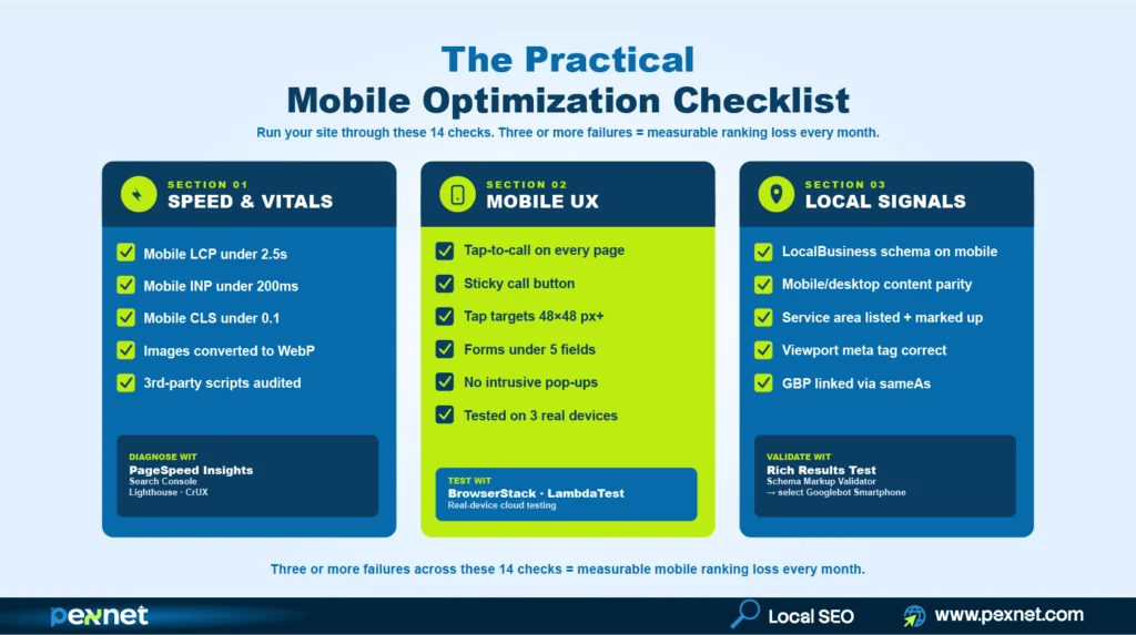
Take your time and run through this list on your own site.
- Mobile LCP under 2.5 seconds (PageSpeed Insights)
- Mobile INP under 200ms
- Mobile CLS under 0.1
- Tap-to-call link on every page
- Sticky call button on service pages
- Touch targets at least 48×48 pixels
- Forms under 5 fields with autofill enabled
- LocalBusiness schema renders on mobile
- No intrusive pop-ups blocking content
- Mobile and desktop content parity
- Site tested on at least 3 real devices
- Service area listed with schema markup
- Viewport meta tag set correctly
- Google Business Profile linked via sameAs
Three or more failures in this list usually means you’re losing measurable mobile ranking ground every month.
Tools for Faster Mobile Optimization
You don’t need many different tools to fix mobile optimization. These six will cover almost every issue for you:
a) Google PageSpeed Insights: diagnoses Core Web Vitals issues with specific fixes
b) Google Search Console (Mobile Usability + Core Web Vitals reports): flags errors across your entire site
c) Lighthouse (Chrome DevTools): runs deep audits on individual pages
d) Chrome User Experience Report (CrUX): shows real-world field data, not lab simulations
e) BrowserStack or LambdaTest: tests on real devices remotely
f) Schema Markup Validator: confirms structured data renders on mobile
Our local SEO specialists prefer using them in this order:
Search Console for site-wide diagnosis, PageSpeed Insights for page-level fixes, CrUX for real-user data, Lighthouse for deep technical audits, then real-device testing for final validation.

Md Riadul Islam
Carpet Cleaning SEO Specialist
With over 10 years of experience, Riadul is passionate about helping local, independent businesses succeed.
He’s now focused on AI’s impacts on niche websites since aside from Google, people are also using different AI platforms for carpet cleaning services.
He found that while Google cares about content relevance and website authority, AI relies more on trust and credibility to determine recommendations. That’s why he prioritises strengthening trust signals for our clients.
Riadul believes that sustainable growth comes from combining strong branding, deep customer trust, and smart SEO approaches. At Pexnet, he shares the strategies, frameworks, and real-world lessons he has refined over a decade.
Get Quality Leads from Us
PexNet Newsletter - Subscribe for SEO news, trends, updates, & more.
Share this job post


Related Posts


We’re All Ears!
A simple, open conversation can create new doorways to your professional and business success. Don’t hesitate. Take the first step right now.